Consume data with Power BI and How to build a simple dashboard.
Consume data with Power BI and How to build a simple dashboard.
Now, after completing practical 6, we know how to upload and load dataset in PowerBI.
Here we will be using Olympics Medal Dataset to generate an analytical dashboard:
About Dataset:
Which Olympic athletes have the most gold medals? Which countries are they from and how has it changed over time?
More than 35,000 medals have been awarded at the Olympics since 1896. The first two Olympiads awarded silver medals and an olive wreath for the winner, and the IOC retrospectively awarded gold, silver, and bronze to athletes based on their rankings. This dataset includes a row for every Olympic athlete that has won a medal since the first games.
Creating Dashboard
Microsoft Power BI has various icons to represent different visualizations. There are charts of all types like bar charts, column charts, stacked bars and columns, pies, half donuts, line graphs, area charts, waterfall charts among others - all represented through icons. The right pane also has a Fields section which allows you to choose and switch between various data fields.
For instance, imagine the dataset you imported has a table with columns (fields) like employee name, employee age in years, salary range, increase in salary over 10 years, employee address and employee ID.
Depending on what you wish to display, you will first have to tick the checkbox for a particular data field, and then you can choose a chart type from the right pane. For example, if you wish to display the salary range composition of employees, you can tick the age checkbox from the right pane and then select a pie chart. The pie chart will best display how many employees have a salary in which range.
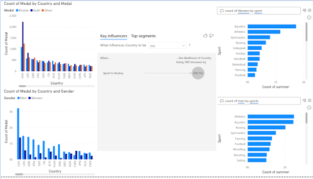
We have generated dashboard like shown below:
Filter Options:


Comments
Post a Comment